I Can Now See Why A Big Pharma Company Liked My Software Daisy
Yesterday, I went to a seminar about medical research.
There was a presentation, where data in several dimensions was shown and the data was crying out for a Daisy Chart.
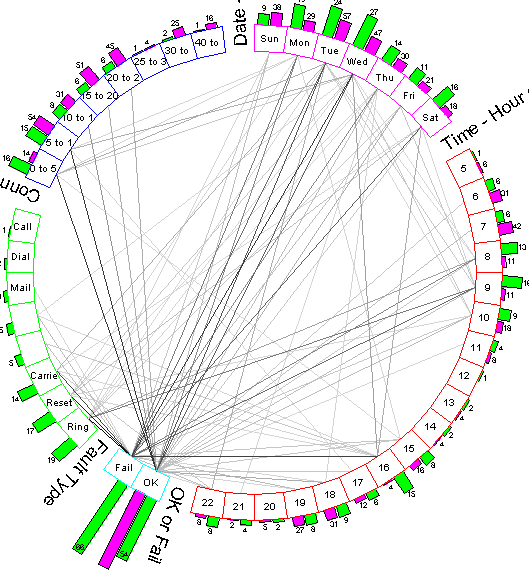
A Daisy Chart
This chart is a very simple presentation of telephone data, but I can imagine arcs showing factors like Dose, Blood Pressure, Sex, Patient Satisfaction etc.
Note.
- This chart is what I call a Day of the Week/Hour of the Day chart, which is a powerful way of looking at any time-based data, like faults or A & E arrivals.
- You can click on the nodes and links of the chart to access the data underneath. So if you wanted all female patients with high blood pressure in a separate Excel spreadsheet, this is possible with a couple of clicks.
- The charts can also be clipped from the screen and inserted into reports.
Daisy was used by one Big Pharma company twenty years ago and after yesterday’s presentation, I can understand, why they used it.
The seminar changed my mind about my attitude to Daisy and I got rather fired up about its possibilities.

Interesting! I purchased Daisy for Glaxo – our use was in high throughput screening where we did a neural network analysis of activity/structure relationships. The issue was the ‘black box’ of the NN simply produced findings that our scientists reported were ‘the bleeding obvious’. Daisy was used to visualise all of the relationships so we could ignore the ‘thick’ lines [the obvious] and look at the detail.
Our approach was explained as the solar eclipse – you have to supress the blinding effect of the main signal in order to investigate the detail around the edge.
Comment by myscriptorium | December 6, 2022 |