Toilet Paper Calculator
Have you ever wondered how many toilet rolls you need to buy?
Those clever mathematicians at Omni, have now come up with a Toilet Paper Calculator.
It’s just one of their suite of Coronavirus Calculators.
I use their other calculators regularly.
This suite of calculators have a slightly humorous edge, that I find acceptable in these troubling times.
Delivery Drone Flies Medical Supplies To Britain’s Isle of Wight
The title of this post, is the same as that of this article on Reuters.
This is the introductory paragraph.
A new drone service will reduce delivery times for urgent medical supplies to a hospital on the Isle of Wight, which lies about 8 kilometres off the south coast of England.
In some ways the most remarkable thing about this project, was that the drone was developed by Southampton University to deliver medical supplies in remote parts of Africa.
- It is twin-engined.
- It has a range of 100 km.
- It can carry a 100 kg payload.
- It can take off and land on short grass runways.
More details can be found on this page of the Southampton University web site.
This is a video of the first delivery.
Are Coeliacs More Risk-Averse?
I am coeliac, which means, that I am allergic to gluten!
So I have to be very careful about what I eat.
I have perhaps been glutened two or three times in the twenty years since I was diagnosed. With me it is nothing serious, but it does mean being close to a toilet for some hours.
If I look at my behaviour generally, I sometimes wonder, if I have become more risk-averse since my diagnosis.
I think too, that I’ve probably become more risk-averse since my stroke, after which, one of the world’s leading cardiologists told me, that if I got the Warfarin right, I’d never have another stroke.
I intend to prove him right! So I watch my INR like a Control Engineer would monitor reactor temperature in a nuclear power station.
I would assume that my risk-averse behaviour is fairly normal.
So if you have had a serious illness or near-death experience from which you have been able to almost fully recover, are you doing your best to make sure that you avoid COVID-19?
The Government’s Terrible COVID-19 Statistics
In an article in The Times today, Sir David Speigelhalter lambasts the Government over their collection of COVID-19 statistics.
I have been involved in the analysis of several very large databases and four factors improve the quality of the answers you get.
- The more records or in this case tests you have, the better. So I back David Speigelhalter! We should stop people on the street and test them!
- The more fields or pieces of data in each test you have, the better. So perhaps each test should be linked to your NHS record.
- The quality of the data is important. In my experience NHS scores about two out of five for quality as a lot of medical staff, often fill it in badly. In one case, I was looking for reasons for low birth weight babies and in many cases, the field was filled with 9.99 Kg.
- And then there’s the output of the data. I was taught how to display data for idiots, by the former Chief Accountant of a FTSE 500 company, who was working as the Chief Management Accountant of a Clearing Bank. He had found showing scatter diagrams with each branch as a single point on a large sheet, really got Branch Managers to think about what they are doing, if they weren’t running with the herd. These diagrams made problem branches stand out like the sorest of thumbs!
So where are the scatter diagrams for all of the Health Authorities in the UK, so everybody can see how their area, is doing against everybody else?
By the way, I trust Sir David, as we have the same birthday and share it with James Cameron, Jeff Thomson, Katherine Hamnett, Lawrence of Arabia, Menachem Begin and Madonna.
Braving The London Underground
I took these pictures today, in a short Underground trip between Angel and Kings Cross St. Pancras tube stations.


It’s not very busy! Is it?
- There was no-one else in the tunnel as I walked between the escalators at Angel station.
- There was only two other people in my carriage on the train.
- There were few people in the tunnels at Kings Cross.
Isuspect that I travelled during lunchtime helped.
What Percentage Of Over 65s In England Have Tested Positive For COVID-19?
On the official government web site, they now give a breakdown of lab-confirmed cases in England by age and sex.
This is their graph.
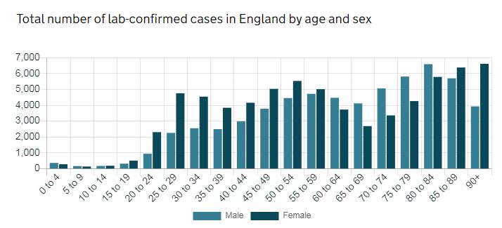
Note.
- From 0-60, there ae more female cases.
- From 60-85, there are more male cases.
- Over 85, there are more female cases.
I do find this unusual. Could it be that more healthcare, teachers, nursery and care home workers are women under sixty.
I’ll now look at the individual figures.
Male
- 0-4 – 356
- 5-9 – 157
- 10-14 – 167
- 15-19 – 310
- 20-24 – 938
- 25-29 – 2256
- 30-34 – 2549
- 35-39 – 2493
- 40-44 – 2986
- 45-49 – 3782
- 50-54 – 4457
- 55-59 – 4725
- 60-64 – 4473
- 65-69 – 4121
- 70-74 – 5064
- 75-79 – 5816
- 80-84 – 6598
- 85-89 – 5703
- 90+ – 3929
Under-65 – 29649
Over-65 – 31231
Over-75 – 22046
Female
- 0-4 – 274
- 5-9 – 129
- 10-14 – 178
- 15-19 – 501
- 20-24 – 2303
- 25-29 – 4756
- 30-34 – 4546
- 35-39 – 3842
- 40-44 – 4160
- 45-49 – 5038
- 50-54 – 5538
- 55-59 – 5018
- 60-64 – 3729
- 65-69 – 2684
- 70-74 – 3359
- 75-79 – 4266
- 80-84 – 5792
- 85-89 – 6387
- 90+ – 6622
Under-65 – 40012
Over-65 – 29110
Over-75 – 23067
Total Under-65 – 69661
Total Over-65 – 60341
Total Over-75 – 45113
Note.
- In an earlier analysis, I thought these were UK figures, so discount those.
- There are no figures for other parts of the UK.
I can now calculate the percentage of Over-65s, who have had lab-confirmed cases in England.
- According to Age UK, there are 11,989,322 who are over 65 in the UK.
- As England is 84.3 % of the UK population according to Wikipedia, that means there are 10,106,998, who are over 65 in England.
Using the total number of over 65 cases in England, this gives a figure of 0.6%.
I can now calculate the percentage of Over-75s, who have had lab-confirmed cases in England.
According to Age UK, there are 5,400,000, who are over 75 in the UK.
As England is 84.3 % of the UK population according to Wikipedia, that means there are 4,552,200, who are over 75 in England.
Using the total number of over 75 cases in England, this gives a figure of 0.99%.
I can now calculate the percentage of Under-65s, who have had lab-confirmed cases in England.
- Using the previous figures, there are 45,870,180, who are under 65 in England.
Using the total number of under-65 cases in England, this gives a figure of 0.15%.
Coronavirus Pandemic Could Cause Deepest Recession On Record, Bank Warns
The title of this post, is the same as that of this article on The Times.
If that is the bad news, what do I make of the sub-title of the article?
Economy projected to bounce back with 15 per cent growth in 2021
That would certainly be a lot better.
But is it feasible?
Readers of this blog, will know, that I regularly flag up ideas, that could help us all, create a greener planet.
Only yesterday, I wrote two articles about Equipmake; a company based in Norfolk, that aims to improve electric transport.
I can see a lot of these green ideas coming to fruition in the second half of this year, fuelled by copious thinking during the lockdown, furlough and the teaching of children. I believe the average guys and girls in the UK and the wider world will have been thinking hard about their future and that of the only planet we’ve got to live on.
This leads me to a green bounce, driven by renewable energy, energy storage, zero-carbon transport, fast internet, energy-efficient housing and other proven concepts.
I suspect though, it could be implemented in some new ways, which only now are being developed.
For every Equipmake, Highview Power, ITM Power and Riding Sunbeams how many other ideas are in development waiting to emerge?
There is also the question of finance.
- I think, that there are a lot of people, who because they have a reserved occupation or a good pension, when we come fully out of lockdown, will have sensible money to spend.
- Spending large amounts is difficult at present.
- Some may have the money in the bank which was reserved for this year’s holiday of a lifetime.
Prudence, would say they might spend it on low-risk purchases and not on expensive exotic holidays, where they might get trapped in a second spike of COVID-19.
Could we see a lot more sales of zero-carbon cars, solar panels, house batteries and air source heat pumps?
Installing these would need a lot of qualified builders, electricians and fitters.
China And US Snub Global Talks On Vaccine
The title of this post is the same as that of this article in The Times.
Judging by the list of those that turned up to the talks, the United States and China care less about the health of their people and the wider world than Saudi Arabia.
My Equilibrium INR Has Risen Under Lockdown
For something like four years my Warfarin regime has been to take 4 mg. every day and to self test every Monday and Friday. It has been a simple regime that has worked well and my INR has stayed between two and three, with 2.4-2.6 being the common readings.
In other words what I would call as a Control Engineer, my equilibrium INR is spot on.
In the past, I have noticed that in times of hot weather my INR has tended to rise and in times of cold weather, it has occasionally dropped. A change of dose to three or five mg. has generally kicked it back towards 2.5 mg.
Doctors and this Control Engineer would say that you shouldn’t chase the INR by constantly changing the dose.
Warfarin also seems to have a cumulative property. A couple of years, I had to have a small operation. I dropped the INR to 2.1 for the operation over three days, by cutting back to 3 mg. After the operation three days at 5 mg. brought it back to 2.5.
Under lockdown, my equilibrium INR rose initially to 3 on a dose of 4 mg. every day.
In a telephone conversation with my GP, we agreed to alternate the dose between 3 and 4 mg. every day. My INR now seems to be stabilising between 2.5 and 2.8.
Why has my equilibrium INR risen under lockdown?
My house can get hot, as it wasn’t designed and built correctly and because of that I am drinking a lot of fluids. When I prick my finger for the self-test, the blood seems more watery than usual, so are all those fluids diluting my blood and causing my INR to rise?
Bodies can’t disobey the laws of physics!
Oh! For a walk by the sea in the sun!
Northern Cities And COVID-19
If you look at the official Government statistics for the total number of cases of COVID-19, as of May 3rd, the number of cases in the two major cities in the North West as follows.
- Leeds – 1463 out of a city population of 789,194 (0.18%) and a metro population of 2,638,127 (0.05%)
- Liverpool – 1454 out of a city population of 494,814 (0.29%) and a metro population of 2,241,000 (0.06%)
- Manchester – 1154 out of a city population of 547,627 (0.21%) and a metro population of 3,748,274 (0.03%)
- Newcastle – 939 out of a city population of 300,196 (0.31%) and a metro population of 1,650,000 (0.06%)
- Nottingham – 537 out of a city population of 321,500 (0.17%) and a metro population of 1,610,000 (0.03%)
- Sheffield – 2191 out of a city population of 582,506 (0.38%) and a metro population of 1,569,000 (0.14%)
Note.
- All populations come from Wikipedia.
- Why is Liverpool 40% worse than Manchester?
- Why is Sheffield the worst?
I will add a few smaller towns andcities.
- Blackpool – 465 out of an urban population of 139,720 (0.33%)
- Caldervale – 252 out of an urban population of 200,100 (0.13%)
- Hull – 469 out of a city population of 260,645 (0.18%)
- Middlesbrough – 566 out of an urban population of 174,700 (0.32%)
- Stoke-on-Trent – 509 out of a city population of 255,833 (0.20%)
- York – 315 out of a city population of 209,893 (0.15%)
I’d like to see full statistics plotted on a map or a scatter diagram.
The latter is a very powerful way to plot data and often they highlight data points that lie outside the underlying pattern of the data.
